
About
Brand and Website
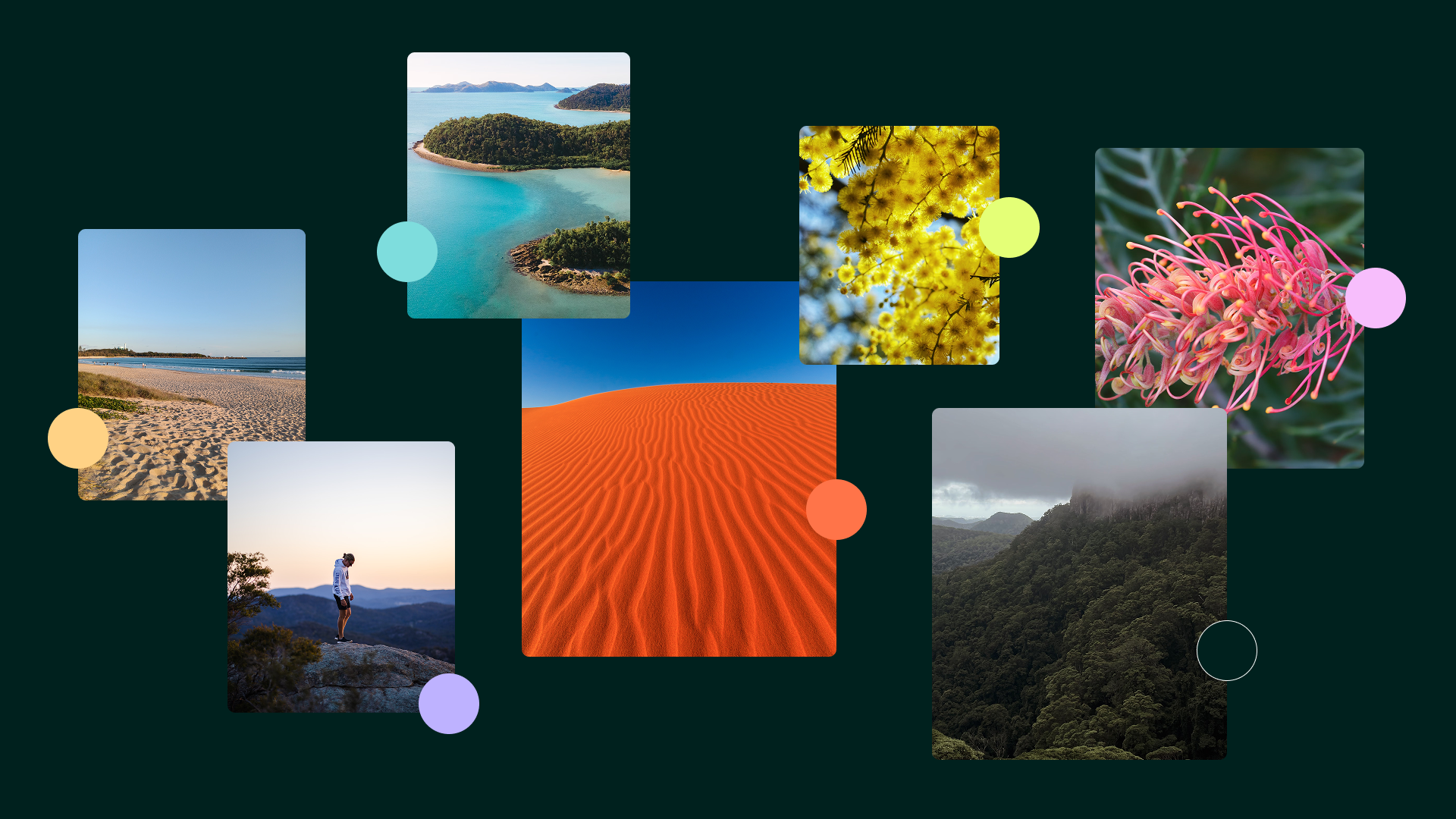
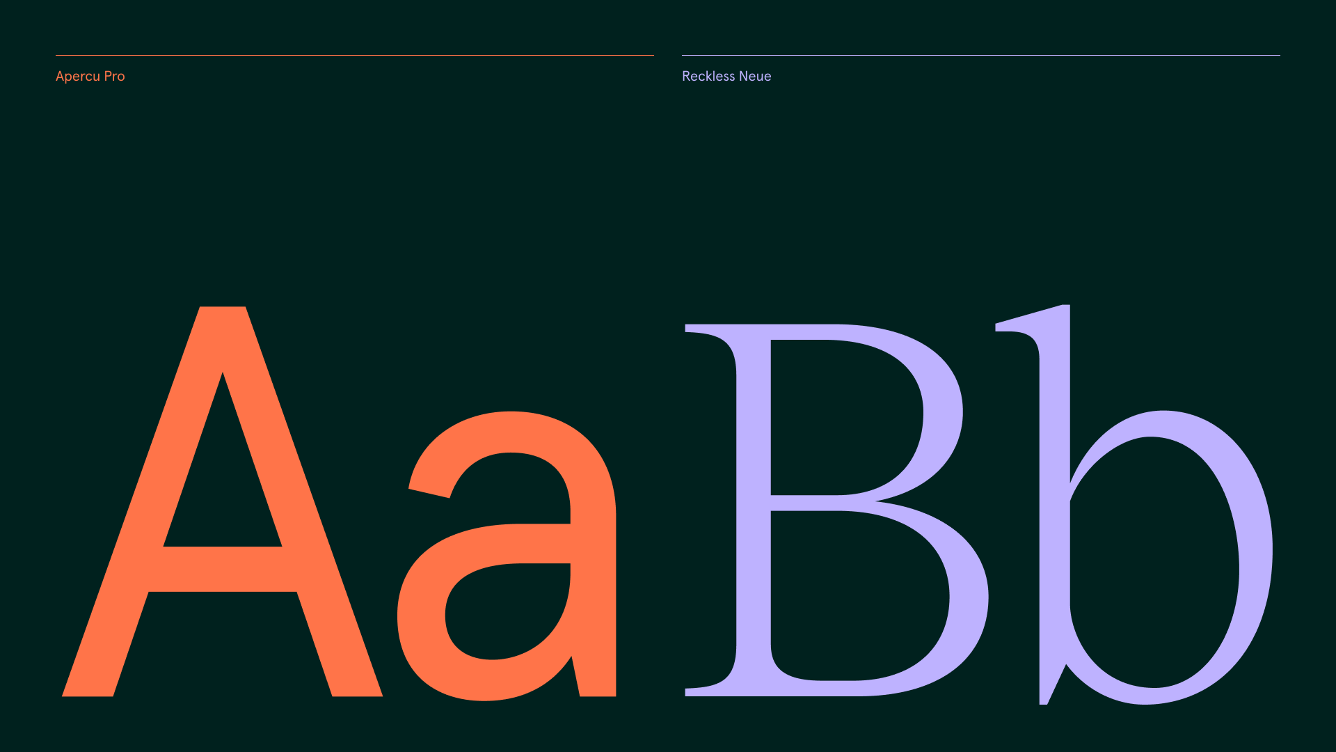
Bigfish worked with Stage Queensland years ago to deliver the brand and website for Artour - QTouring's predecessor. With QTouring, it was important to highlight the intrinsic connection to Queensland in the brand, and improve on the UI/UX of the website. Starting with the brand, we wanted to reflect the core theme of touring and Queensland. We created a custom 'Q' that featured a loop that is both suggestive of a location pin, and inherently suggestive of movement and travel. We paired this with a colour palette that is based on the Queensland landscape, but with strong saturation to appear vivid and contemporary on a digital platform. Following on from the traveling 'Q', we created a complementary wavey motif that, while flexible in its application, ensures the brand always looks uniquely QTouring. We attached specific meanings to the colour palette to help people visually differentiate the varied content that QTouring produces, helping reduce the complexity of the website. The website was an interesting challenge: it was to be a cornerstone of their offering, allowing artists and venues from around Queensland to publish their profiles and apply for various events and initiatives. This required the design of both the front end of the website as well as a user portal.
Services
- Brand
- Website
- Visual Identity
- Naming
- Logo Design


Website
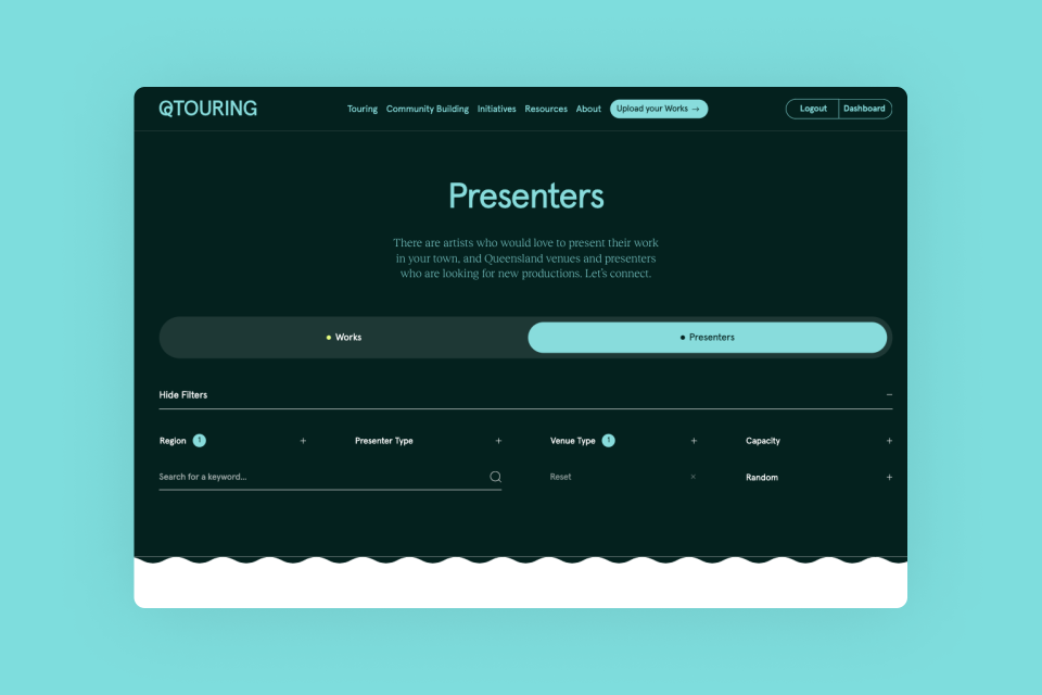
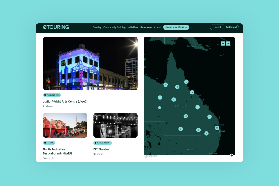
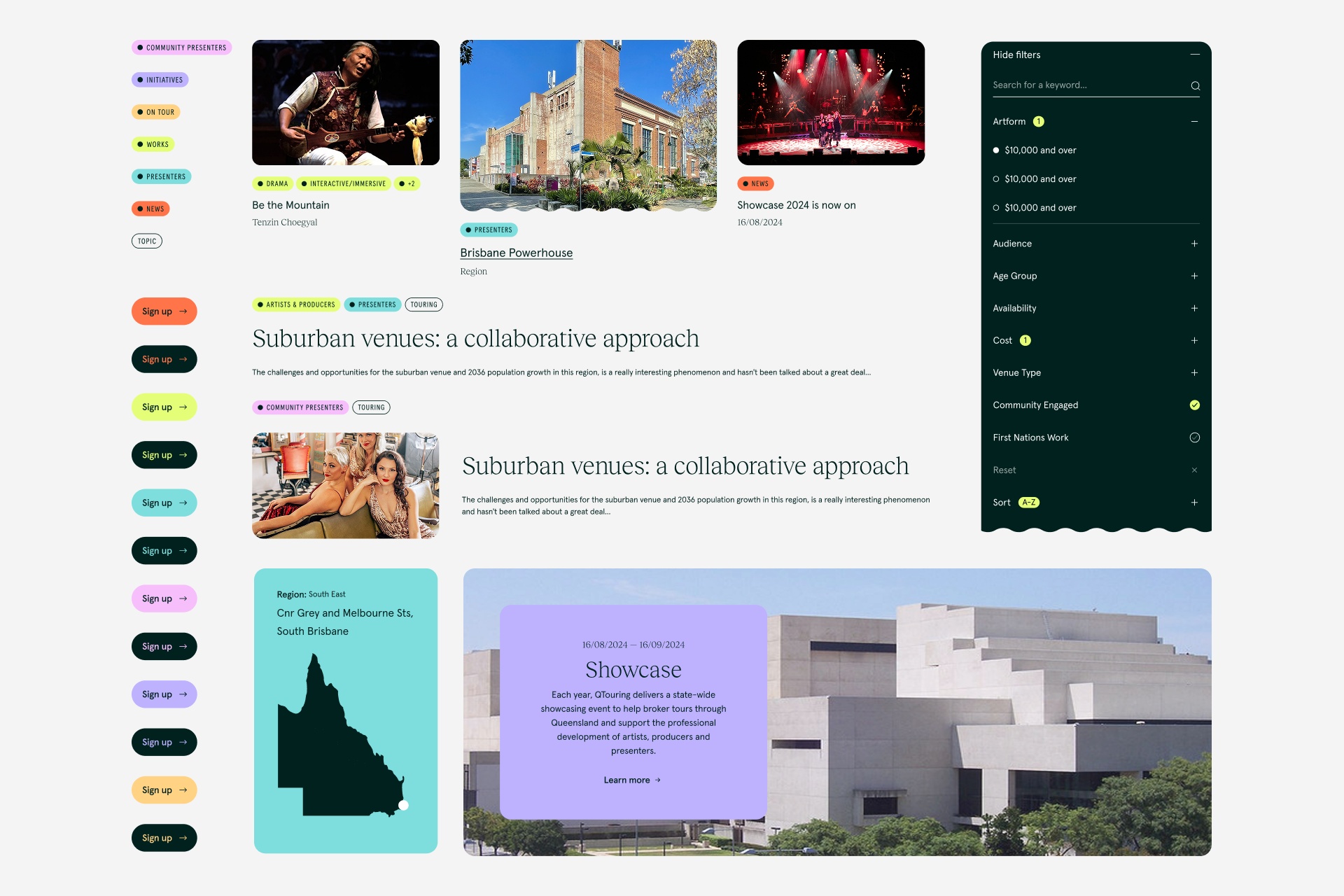
We designed a flexible and extensive component system for the QTouring website, to ensure the content was on-brand, accessible and easy for the client to create varied content. Navigation was also a key concern with the website, as there are so many content types (Works, Presenters, Resources, Articles, Initiatives) with different categorisation requirements. We leaned on the colour-coded palette to visually signpost different things throughout the site, as well as clear tagging and varied ways of directing users around the site in a visually engaging way.


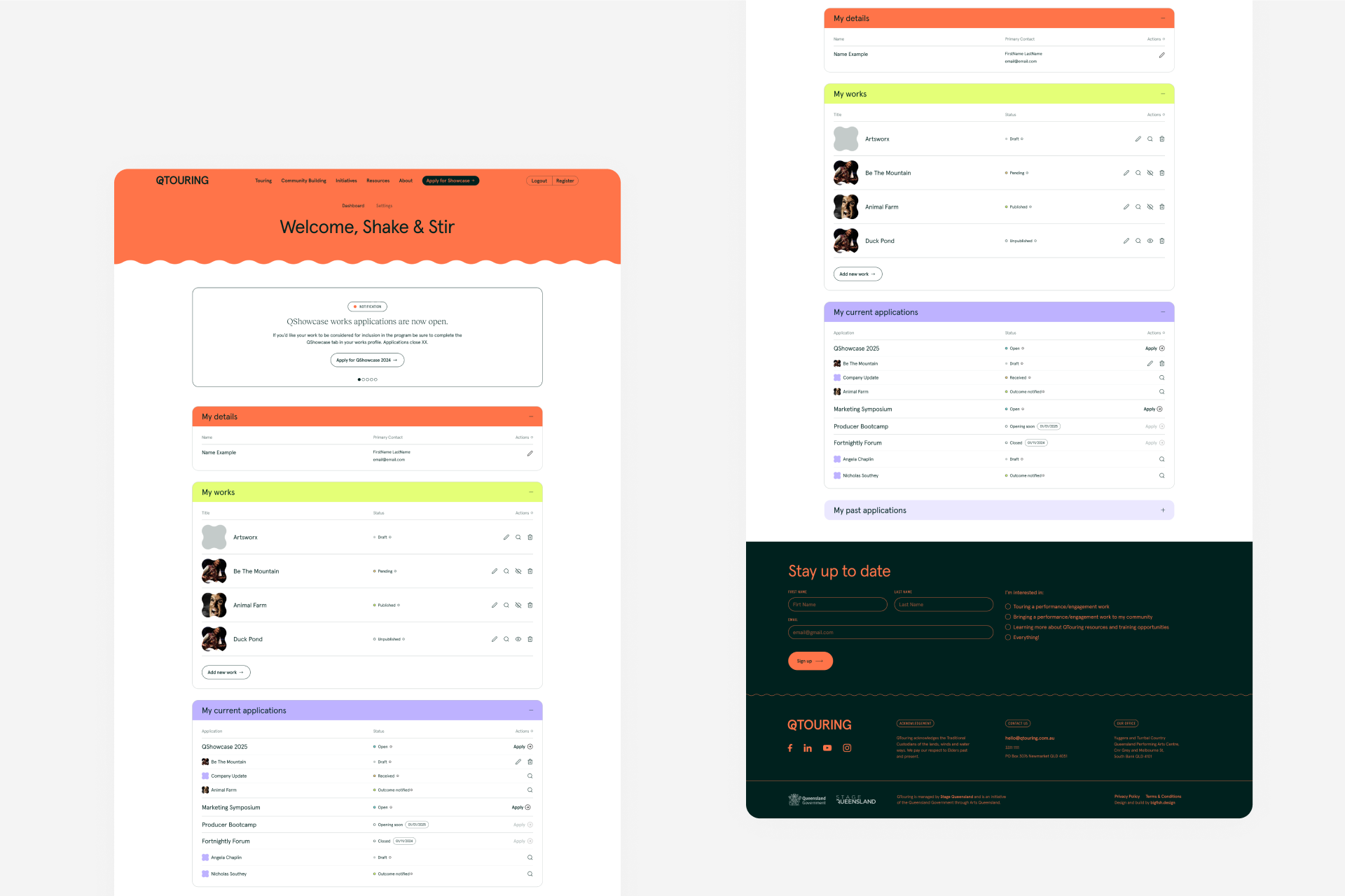
Portal
The portal needed to provide a way for users to create new Works and Presenters that would feature on the site after an approval process. These Works and Presenters would feature text, images and videos, and they needed to be categorised properly so the public could effectively search for them on the front end. Finally, to ensure they were happy with what they were submitting, we developed a way for users to preview their not-yet-submitted Works and Presenters as they would appear on the front end, so they could preview their changes as they were going. The portal also needed to be a home for applications to QTouring's many initiatives. All of this information needed a clear dashboard to keep track of everything, including the statuses attached to each Work or Initiative application. We bundled all of this complexity into a clean and clear design, that empowered the client to work directly with their new user base.